Before he ever shouted “action” to bring the iconic scene of the ‘railgari’ to life or spun tales of a betel-chewing detective whose simpleton image opposed the upper class mannerisms of the suave sleuths of Hollywood noir, Satyajit Ray wielded his paintbrush to fashion a few of the most memorable illustrations in advertising history. This background in graphic design and info-graphics greatly influenced his unique visual style in his films characterised by careful composition and attention to detail. It also allowed him to approach filmmaking with a fresh perspective, incorporating innovative techniques and artistic elements into his work. In that, Ray was ahead of his times.
Embarking on his professional journey, Satyajit Ray found himself at D.J. Keymer & Co, an esteemed British-owned advertising agency, where he cut his teeth as a junior visualiser. Upon joining Keymer, Ray entered a bustling agency experiencing a period of remarkable success. With prime accounts for esteemed brands such as Philips, Lipton, Dunlop, CK Sen, Tea Board, Burmah Shell, ICI, ITC, Atlantis East, Bata, Martin Burn Group, and others, the agency had at its helm, creative director, Annada Munshi, a revered figure in advertising known for his innovative approaches. It was Munshi who took under his wing promising young talents like Satyajit Ray, OC Ganguly and Makhan Dutta Gupta, all of whom joined the agency concurrently. Guided by Munshi’s expertise, Ray honed his skills in the technical nuances of layout and production design.
Advertisement
Among his early creations were captivating illustrations that breathed life into commercial products, from the alluring half-opened Margo soap to the remarkable sight of cigarettes protruding from a tin of Chelsea Cigarettes or a pack of Tenors. It was Ray’s distinct approach to advertising that set him apart. Eschewing cluttered compositions, he often opted for a singular focus on the product, magnifying it to command attention. This minimalist strategy not only offered viewers an intimate glimpse into the product but also seared it into their memories through its stark isolation.
In one of his sketches promoting Chelsea Cigarettes, Ray sketched a narrative across four panels. The vignette unfolded at a cricket match, where a struggling cricketer found his form after indulging in a Chelsea cigarette during lunch, ultimately leading to successful wicket-taking. Similarly, another sketch portrayed a scene from the racecourse, where a despondent punter experienced a miraculous turnaround after enjoying Chelsea cigarettes, resulting in a victorious ‘double’.
Another notable creation in Ray’s repertoire was Tea with Music, where wisps of steam from a cup of tea gracefully morphed into the flowing hair of a woman engrossed in playing a musical instrument. The woman’s flatly delineated face in the illustration is reminiscent of traditional Bengali figurative painting.
Before joining D.J. Keymer & Co in 1943, Ray practised oriental art under the tutelage of Nandalal Bose and Benode Behari Mukherjee. Of all the influences shaping his artistic sensibilities, Satyajit Ray held his time at Shantiniketan in highest regard. Enrolling as a Fine Arts student in 1940, Ray found himself immersed in the ethos of Shantiniketan’s Kala Bhavan, renowned for its dedication to Indian traditions, innovation and artistic freedom.
The brush drawings featured in the Jabakusum hair oil advertisements bore the unmistakable imprint of Ray’s formative years at Shantiniketan. Through playful imagery, the ad mocked the then women’s reluctance to tend to their hair or indulge in proper hygiene practices to stave off hair loss. Much like the subtle narratives woven into Ray’s short story sketches, the underlying message of the advertisement was conveyed effortlessly, even without the need for accompanying text. The illustration portrayed a woman draped in a sari, exhibiting a palpable aversion to combs and showers. A subtle yet deliberate off-centering of the black shadow lent a sense of dynamism to the foreground figures, accentuating their disdain for grooming rituals. Additionally, the meticulously emphasised letter ‘J’, incorporating the product photo within its contours, added a refined touch to the composition.
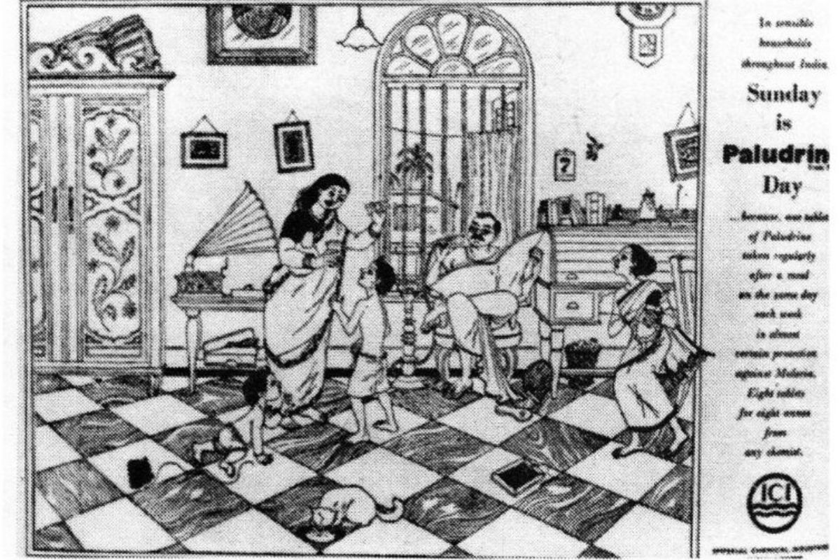
Among his other most renowned endeavours was the promotional campaign for Paludrine, an anti-malarial medication manufactured by Imperial Chemical Industries (ICI). What set Ray’s advertisements apart were the striking compositions infused with a dramatic flair. Each newspaper ad, named “Sunday is Paludrine Day”, within the campaign portrayed scenes from the lives of households on a tranquil Sunday morning, depicting family members engaging with one another in shared living spaces while benefiting from the protection of Paludrine. One ad depicted a modern Indian family amidst a retinue of assistants, another captured the essence of a traditional middle-class family, while the third transported viewers to a serene garden setting.
Ray also crafted another noteworthy advertisement, this time for the Indian Tea Board. This ad campaign took on a more infographic approach, succinctly conveying the five essential rules for brewing a perfect cup of tea.
Interestingly, Ray also designed an advertisement for Philips. Featuring a woman reading a book, accompanied by the tagline “Philips for light”, the minimalist illustration cleverly served as a metaphor for illumination. Unlike traditional advertisements for lighting companies that typically highlight a physical light source, Ray’s depiction elegantly conveyed the presence of light itself, transcending the need for explicit imagery.