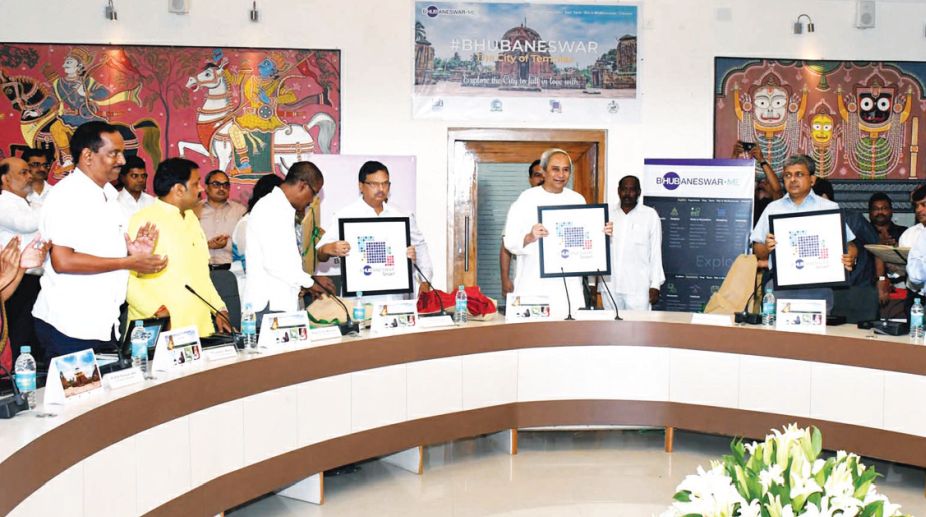
Chief Minister Naveen Patnaik greeted people of Bhubaneswar on the eve of the 70th Capital Foundation Day on Thursday for their untiring efforts to make the state capital a great place to live, work and enjoy.
“Our beautiful city is constantly trying to upgrade its infrastructure for benefits of its citizens. Thursday, the city makes the beginning of a journey to incorporate smart technology-enabled solutions to help every citizen in “ease of living”, he observed.
Bhubaneswar Smart City Limited has come out with a vibrant logo representing a fast developing urban economic centre. The logo significantly captures strategic vision of the city.
Smart City Company’s website will provide information on various projects being taken up by the State Government for development of the capital city.
The Bhubaneswar,me website of the Bhubaneswar Development Authority would immensely help the tourists who are planning to visit our city. The promotional video on “Visit Bhubaneswar” shows the city from a visitor’s perspective and should help in positioning of our city as a “Must See” City in India. Bhubaneswar has evolved as a truly Global City.
This LOGO with its vibrant colours represent a fast developing smart city in the form of a butterfly signifying growth, motion and youthful energy.
The five colours used in this LOGO trace their origin to the five visions of Bhubaneswar Smart City proposal i.e. Liveable city, Eco-friendly city, Child Friendly city, Transit-oriented city and emergence of Bhubaneswar as a Regional Economic Hub.
The square shapes represents strength, solidarity, purpose, symmetry, professionalism and efficiency. The shaded colours given to the boxes arranged creatively in different shapes along with the Wi-Fi symbol signifies the element of technology.
To promote & brand Bhubaneswar as the HUB of education, sports, IT & heritage tourism, a circle has been used to creatively carve out the word “HUB” out of Bhubaneswar.
Chief Minister Naveen Patnaik greeted people of Bhubaneswar on the eve of the 70th Capital Foundation Day on Thursday for their untiring efforts to make the state capital a great place to live, work and enjoy.
“Our beautiful city is constantly trying to upgrade its infrastructure for benefits of its citizens. Thursday, the city makes the beginning of a journey to incorporate smart technology enabled solutions to help every citizen in “ease of living”, he observed.
Bhubaneswar Smart City Limited has come out with a vibrant logo representing a fast developing urban economic centre. The logo significantly captures strategic vision of the city.
Smart City Company’s website will provide information on various projects being taken up by the State Government for development of the capital city. The Bhubaneswar,me website of the Bhubaneswar Development Authority would immensely help the tourists who are planning to visit our city.
The promotional video on “Visit Bhubaneswar” shows the city from a visitor’s perspective and should help in positioning of our city as a “Must See” City in India. Bhubaneswar has evolved as a truly Global City.
This LOGO with its vibrant colours represent a fast developing smart city in the form of a butterfly signifying growth, motion and youthful energy. The five colours used in this LOGO trace their origin to the five visions of Bhubaneswar Smart City proposal i.e. Liveable city, Eco-friendly city, Child Friendly city, Transit-oriented city and emergence of Bhubaneswar as a Regional Economic Hub.
The square shapes represents strength, solidarity, purpose, symmetry, professionalism and efficiency. The shaded colours given to the boxes arranged creatively in different shapes along with the Wi-Fi symbol signifies the element of technology.
To promote & brand Bhubaneswar as the HUB of education, sports, IT & heritage tourism, a circle has been used to creatively carve out the word “HUB” out of Bhubaneswar.