Sundar Pichai’s Stanford homecoming met with boos, walkout and pro-Palestine protest
A group of students staged a pro-Palestine walkout during Stanford University's commencement ceremony as Google CEO Sundar Pichai delivered the graduation address.
In keeping with the tradition of throwing spotlight on the most significant events from around the world, Google on Friday,…

(Photo: Google)
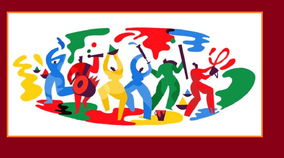
In keeping with the tradition of throwing spotlight on the most significant events from around the world, Google on Friday, 2 March, replaced its official logo with a unique doodle to celebrate Holi, the festival of colours.
The doodle shows colourful silhouettes of six dancing men and women, some of them holding paraphernalia associated with the festival such as pichkaris and dhols.
Advertisement
The doodle depicts the revelry of the festival, which marks the end of the winter season and the arrival of the spring.
Advertisement
“Red, yellow, blue, and green are a few of our favourite colours all year round, but today we’re putting them front and centre for an extra special reason,” reads Google’s description.
According to Google, each colour has a special significance. “Red signifies love and fertility; yellow is the colour of turmeric, a natural remedy; blue represents the beloved Krishna; green symbolises spring and new beginnings,” described Google.
Describing the festival, Google said that it is a time when family and friends come together to feast, dance, and laugh while dousing each other with coloured powder and water.
Holi is also seen by many as a celebration of the triumph of good over evil. A day before the festival, many symbolically burn the effigy of Holika, the sister of the demon king Hiranyakashipu who attempted to kill her own nephew because of his devotion to Lord Narayana.
The doodle has been designed by Kolkata-born Amrita Marino, who is now a New York-based independent graphic designer and illustrator.
A qualified Electrical Engineer, Marino left the world of Information Technology to pursue a creative path.
Advertisement