Sundar Pichai’s Stanford homecoming met with boos, walkout and pro-Palestine protest
A group of students staged a pro-Palestine walkout during Stanford University's commencement ceremony as Google CEO Sundar Pichai delivered the graduation address.
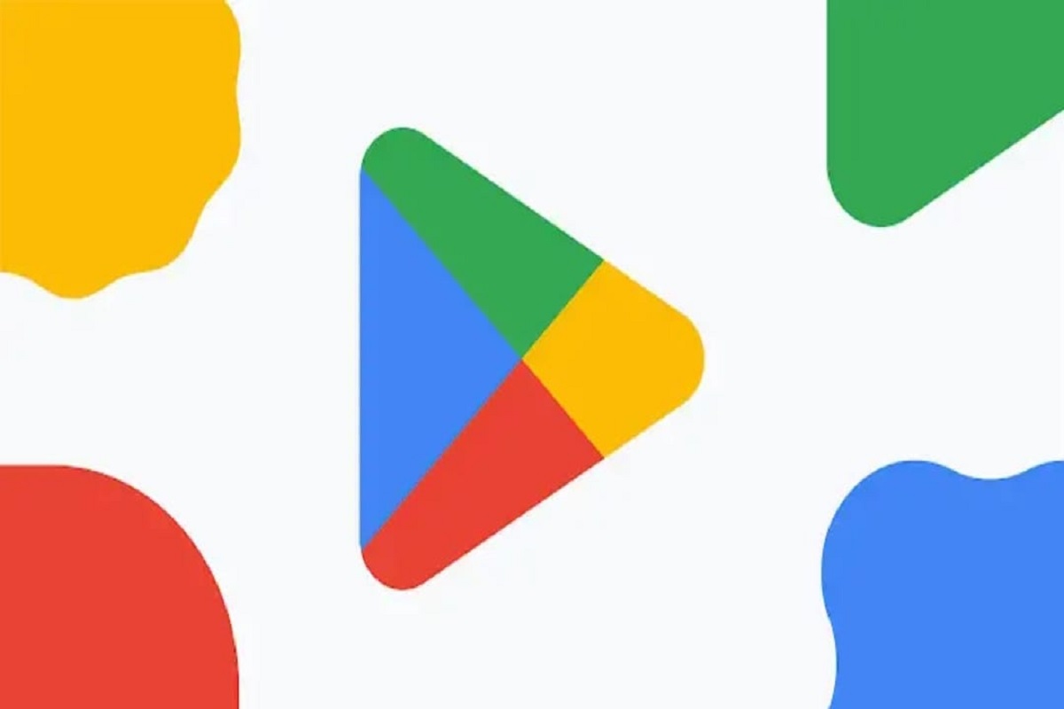
Google has marginally changed the general state of its Google Play Store logo. However, the most striking changes are the less dynamic tones that match the green, yellow, blue, and red tint

Pic (IANS)
The world’s biggest search engine and tech giant Google’s Play Store formally finished 10 years, it is presently getting another logo to praise its tenth anniversary.
Google has marginally changed the general state of its Google Play Store logo. However, the most striking changes are the less dynamic tones that match the green, yellow, blue, and red tints that Google utilizes for the overwhelming majority of its different administrations.
Advertisement
An unobtrusive change likewise supplements the new Chrome logo refreshed recently, reports The Verge.
Advertisement
“We are introducing a new logo that better reflects the magic of Google and matches the branding shared by many of our helpful products — Search, Assistant, Photos, Gmail, and more,” Tian Lim, VP of Google Play, was quoted as saying.
The new logo and iconography additionally mark 10 years of Google Play after it was rebranded from the Android Market in 2012.
“A decade later, more than 2.5 billion people in over 190 countries use Google Play every month to discover apps, games, and digital content,” Lim said.
“And more than 2 million developers work with us to build their businesses and reach people around the globe,” Lim added.
To stamp the 10 years of Google Play, Google is likewise offering a lift to Google Play Points. Assuming clients enact the focuses supporter, they will acquire 10x focuses on buys, incorporating most in-application things.
(inputs from IANS)
Advertisement