Meta to lay off nearly 8,000 employees; Singapore staff first to be notified
The parent company of Facebook, Meta Platforms Inc., is set to lay off nearly 8,000 employees and has begun alerting thousands of staff members about the job cuts.
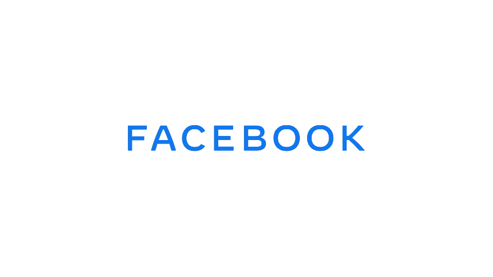
New logo represents Facebook the parent company

Facebook rebrands as FACEBOOK. (Photo: Facebook)
Facebook unveiled a new logo today that is meant to represent the parent company and differentiate it from its app like Facebook, Instagram, WhatsApp, and more.
The new logo uses custom typography and is “designed for clarity”, with the goal of creating a “visual distinction between the company and app”. The logo is supposed to be put to use in the “coming weeks” within Facebook products and marketing materials.
Advertisement
The logo just says “Facebook,” but in a really bland and generic font that looks like it would fit well on a credit card. A GIF shows the word mark displaying in different colors to represent the different brands — blue for Facebook proper, green for WhatsApp, pinkish for Instagram, and so on.
Advertisement
“The new branding was designed for clarity, and uses custom typography and capitalization to create a visual distinction between the company and app,” Antonio Lucio, Chief Marketing Officer, said in a statement on Monday.
The company has services like the Facebook app, Messenger, Instagram, WhatsApp, Oculus, Workplace, Portal and Calibra (digital currency Libra project). Over the coming weeks, Facebook will start using the new brand within its products and marketing materials, including a new company website.
“This brand change is a way to better communicate our ownership structure to the people and businesses who use our services to connect, share, build community and grow their audiences,” said Facebook.
(With input from agencies)
Advertisement