
Amidst rising cases of COVID-19 for the past few weeks across the country, the Central government has provided the option of work from home to its employees along with staggered office timings.
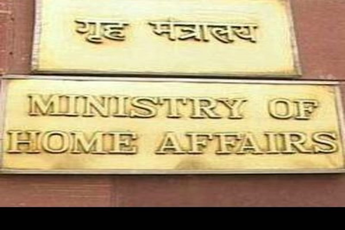
The Ministry of Home Affairs on Thursday issued a notification urging officers up to the level of under-secretary to work from home. However, Deputy Secretary and above-ranking officials have to attend office regularly.
Advertisement
Those officers who will physically attend office have to strictly follow COVID-19 protocols of social distancing, wearing of a mask, using hand sanitiser.
Advertisement
The Home Ministry also introduced staggered office timings to avoid ruh in commuting in lifts and corridors.
“Crowding in lifts, staircases, corridors, common areas including refreshment kiosk and parking areas is to be strictly avoided and meetings, as far as possible, to be conducted through videoconferencing,” the order issued by the Home Ministry stated.
Meanwhile, those officials who are not attending office on a given day will have to be available on the telephone or through other means of communication at all times from their residence.
India reported 2,17,353 new COVID-19 cases taking the total number of active cases to 15,69,743, and the death toll to 1,74,308.
India’s cumulative vaccination coverage exceeded 11.72 crores with over 27 Lakh doses given in the last 24 hours.
Advertisement